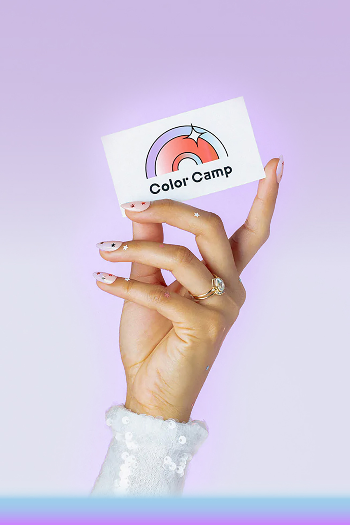
Color Camp
Project details
- Art Direction
- Brand Identity
- Branded Environment
- Campaign
- Marketing Collateral
- Packaging
Challenge
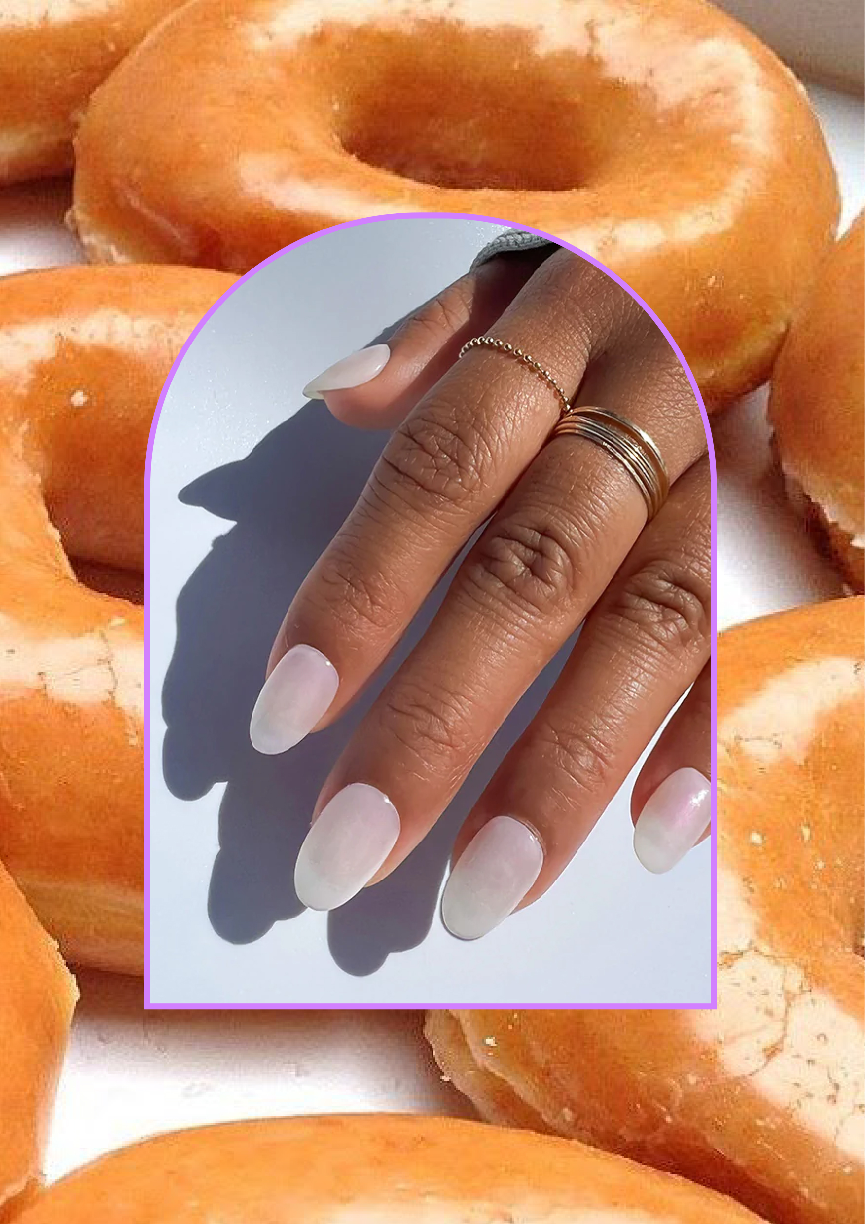
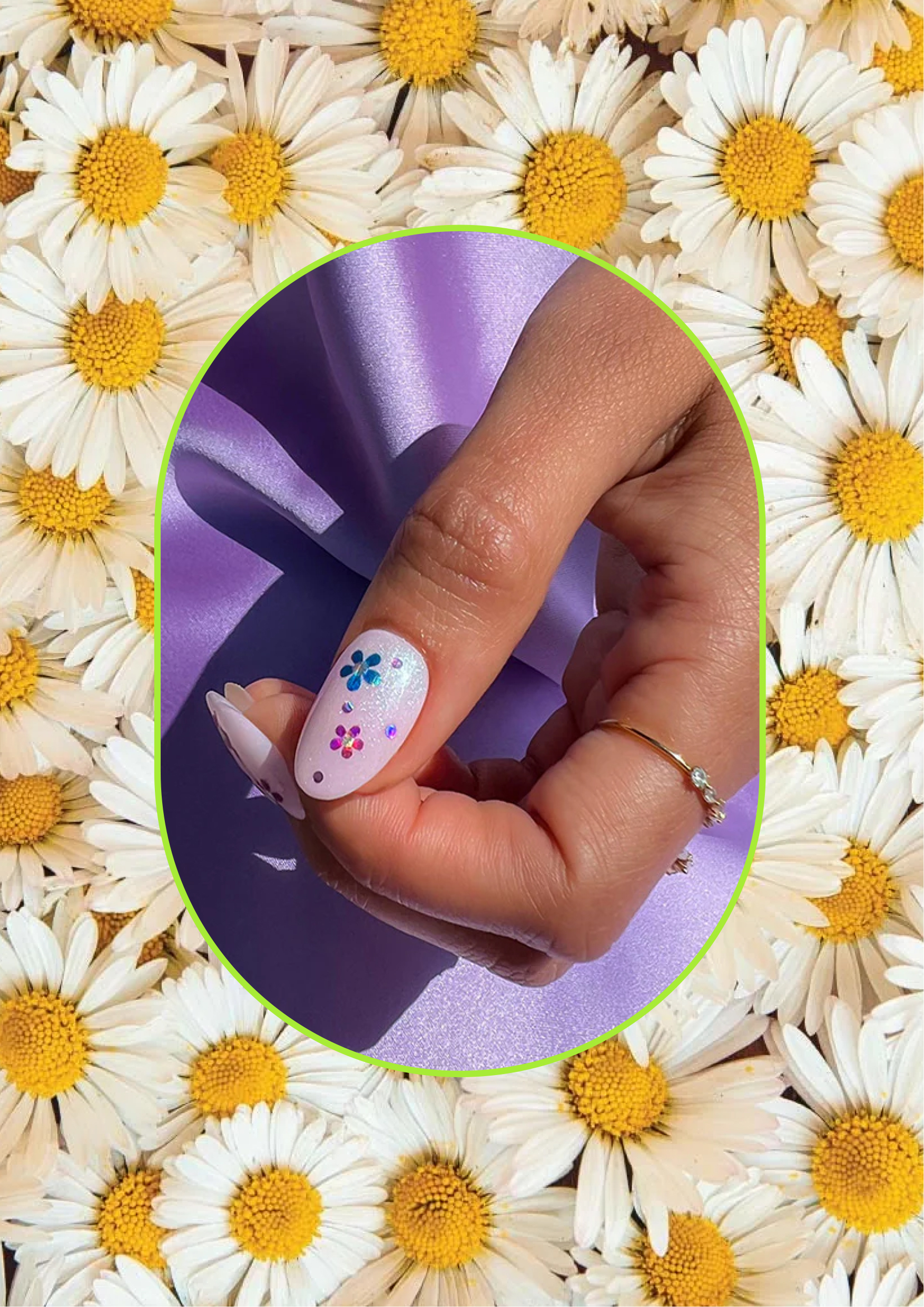
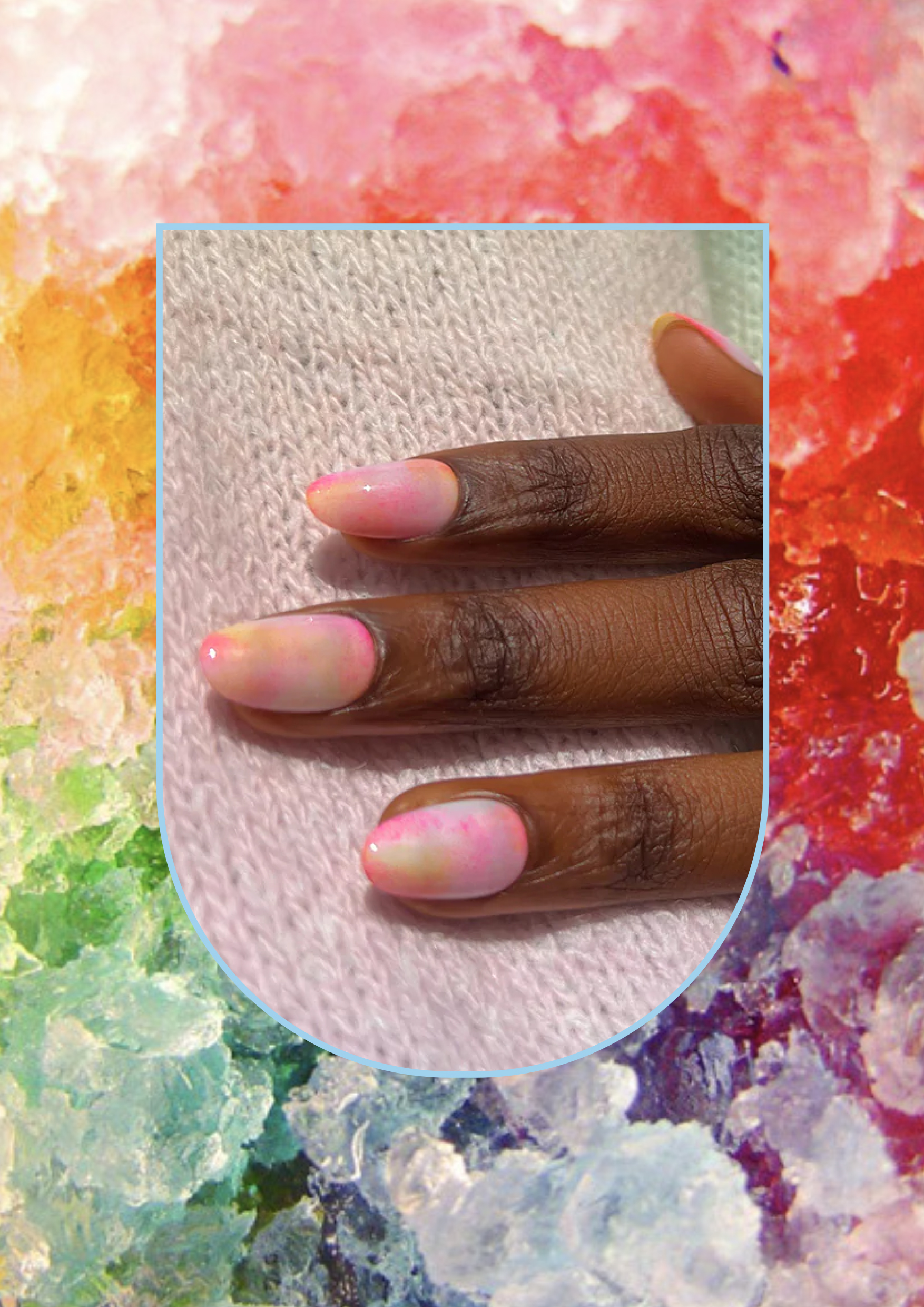
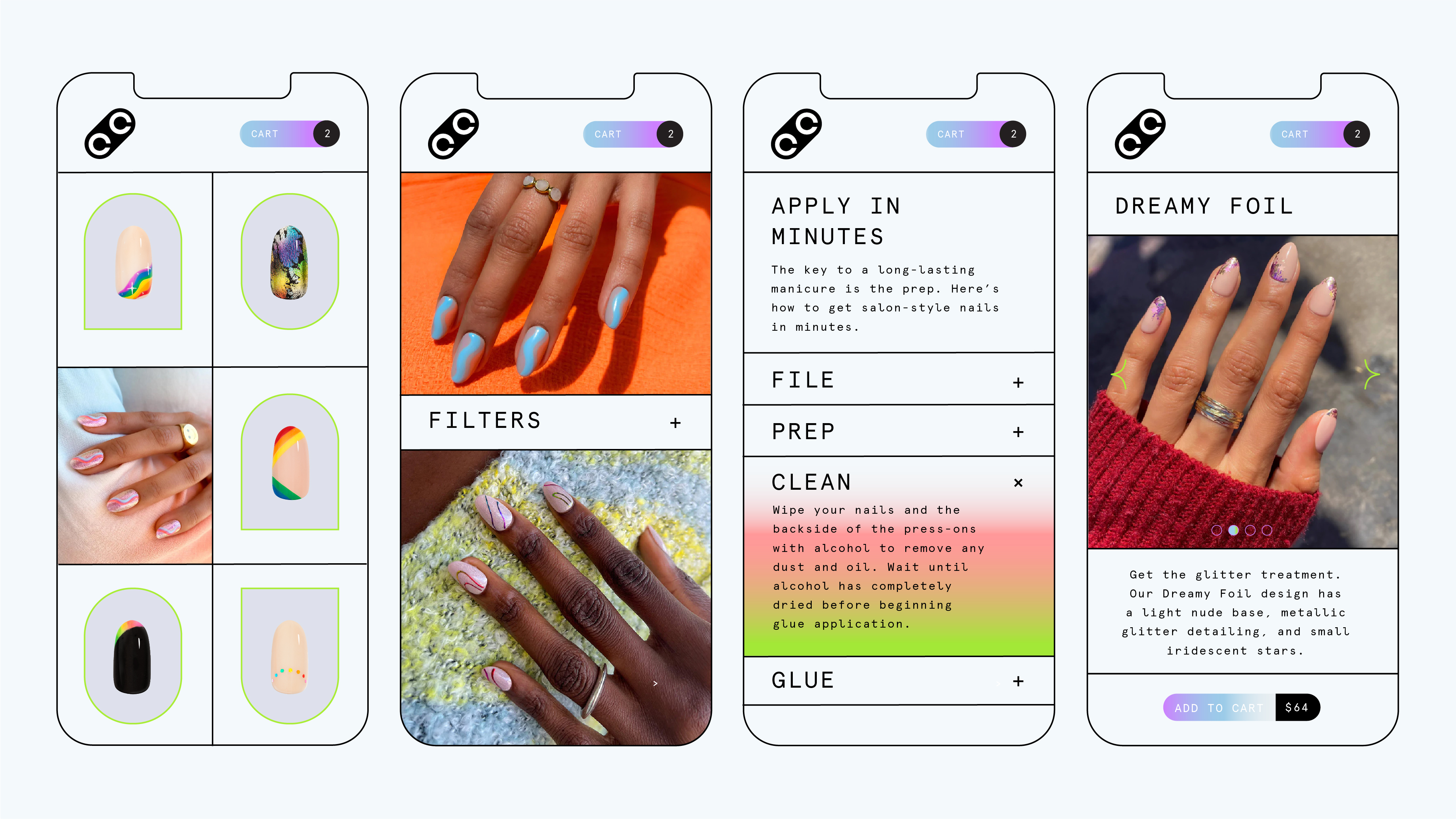
Design a brand identity that would excite and attract the quintessential LA cool girl. Make the identity flexible enough to expand the brand into other markets as they continue to grow and open new locations and into the eventual reality of the 2020 pivot, creating custom super gel press ons.
Solution
Color Camp was the dream project in more ways than one. Not only did we have a blast designing their complete brand identity from the ground up, but we were also given the opportunity to direct the design of the physical space as well. Our approach was simple: in order to get millennials like ourselves to make Color Camp their go-to manicure bar, we needed to focus on user experience and visual appeal.
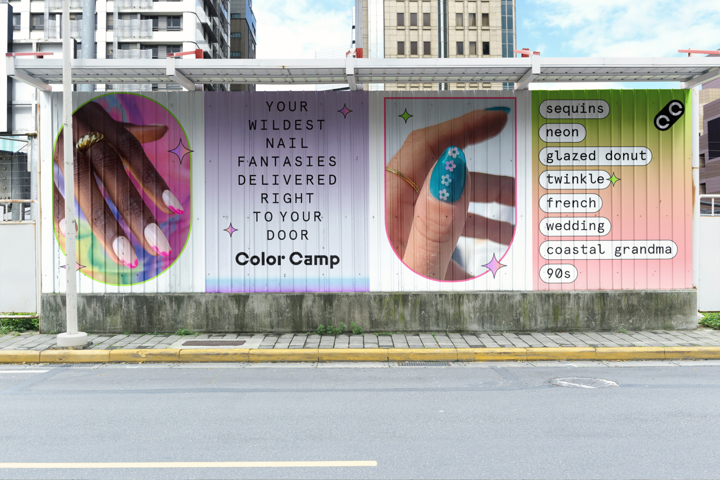
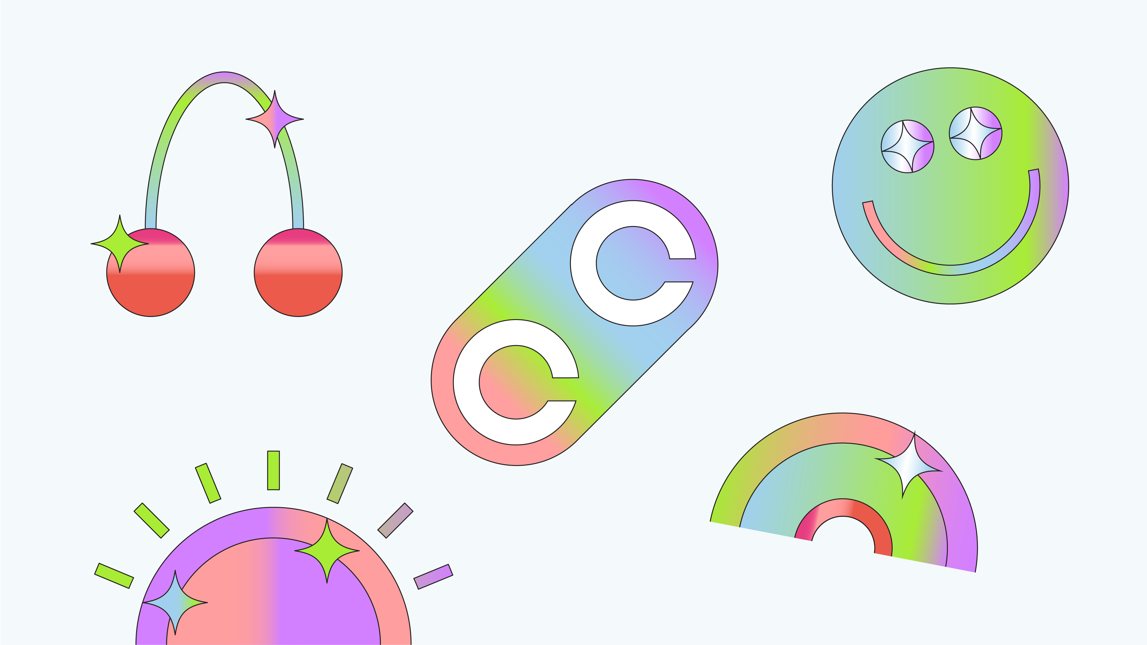
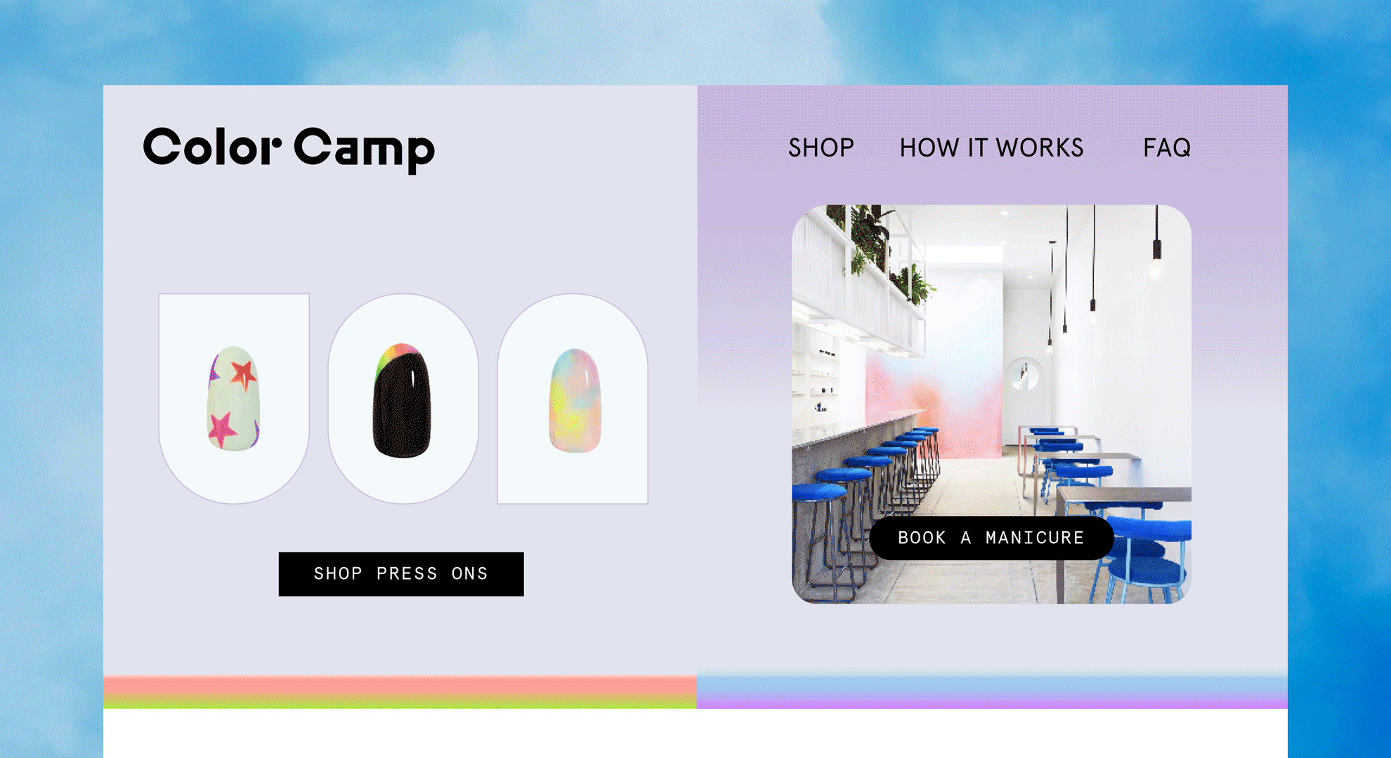
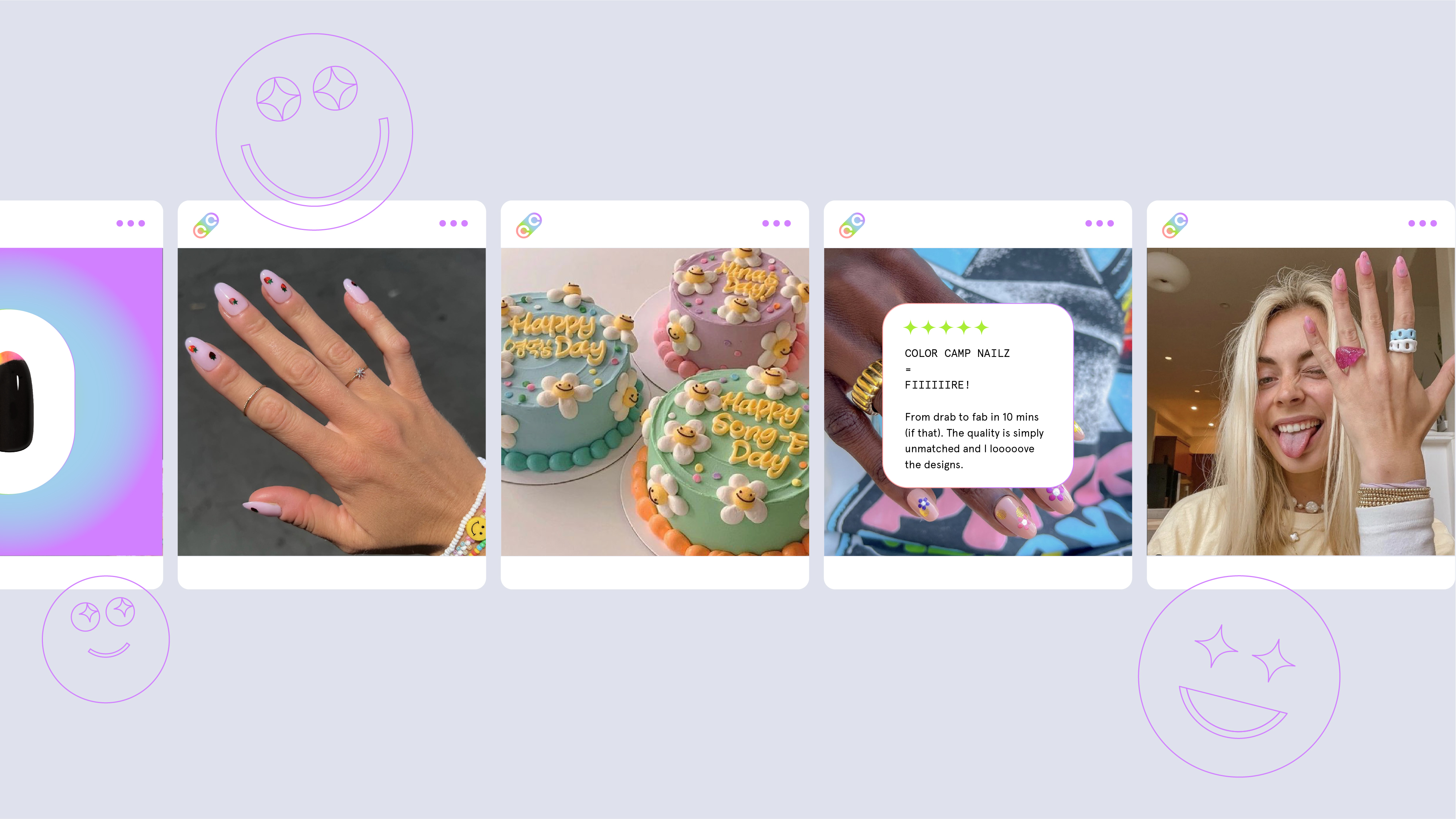
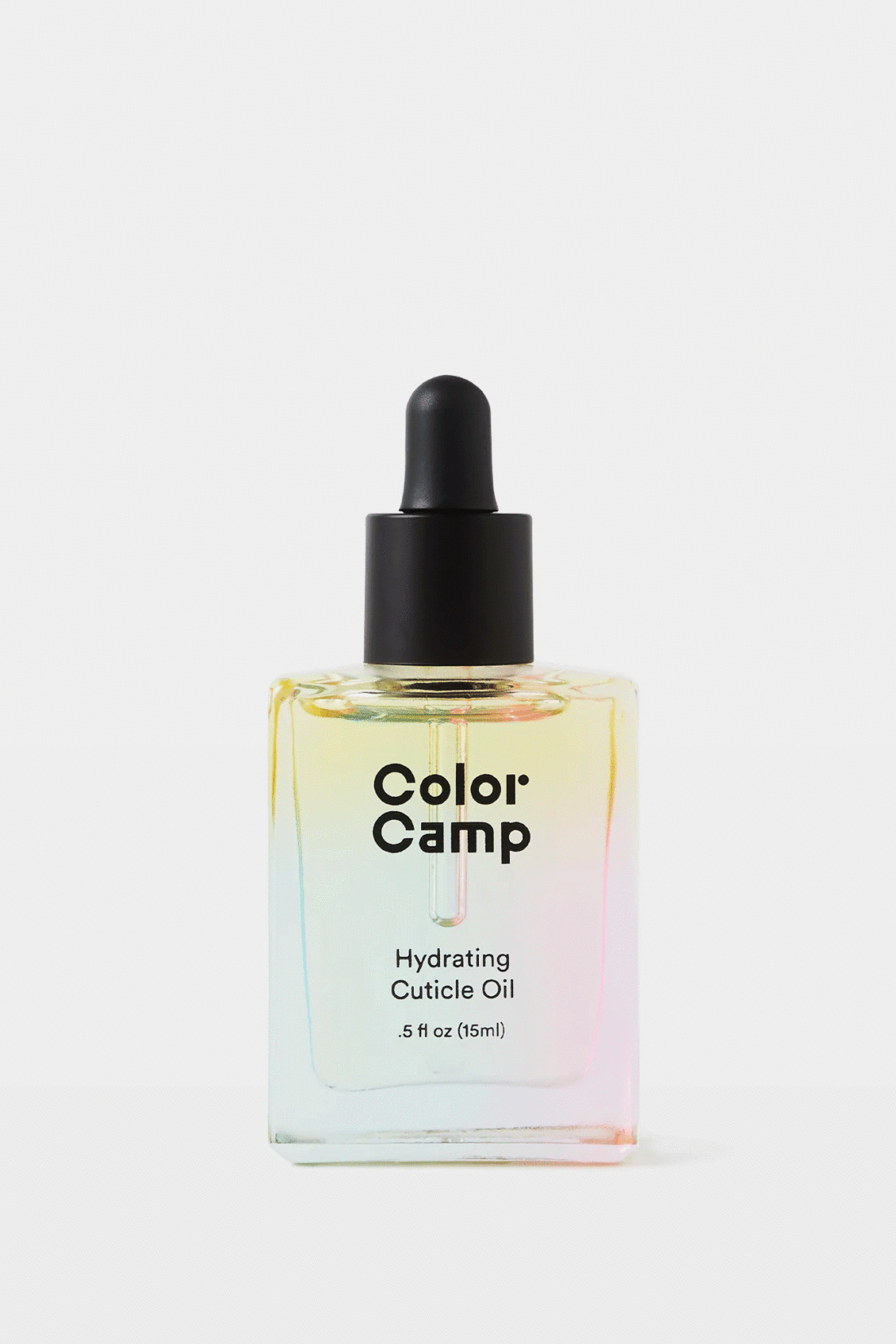
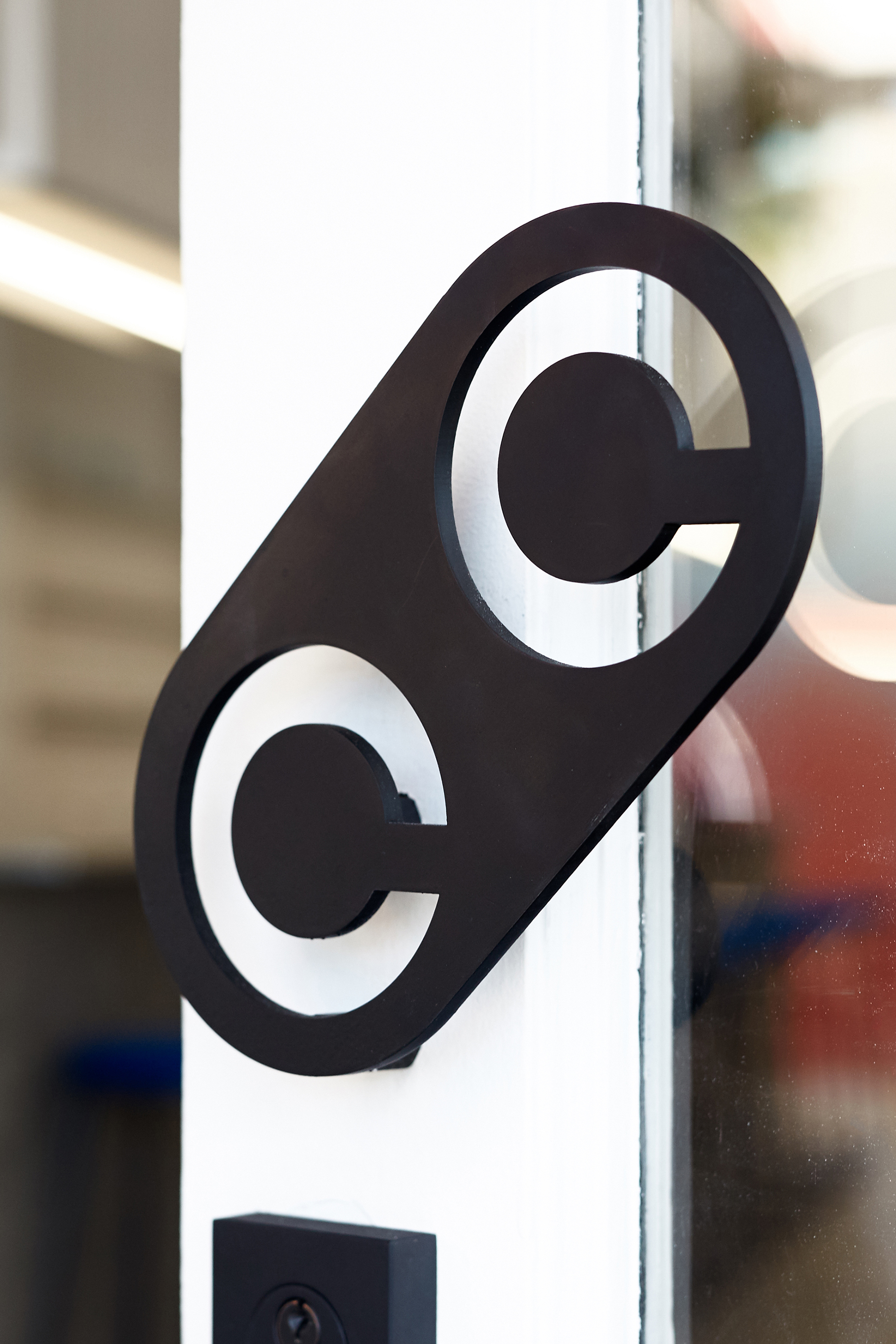
We started with desiging a bespoke wordmark and icon inspired by the geometric nail art that Color Camp would specialize in. Next, we designed a website that not only educated the customer on the offerings, had a seamless booking process, but also further expressed the brand’s bright and fun energy. For the launch campaign, we provided art direction, casting, and styling. We then applied the visual identity across all touch points, from gift cards to ad campaigns, door handles to neon signs. Cohesion is Queen.
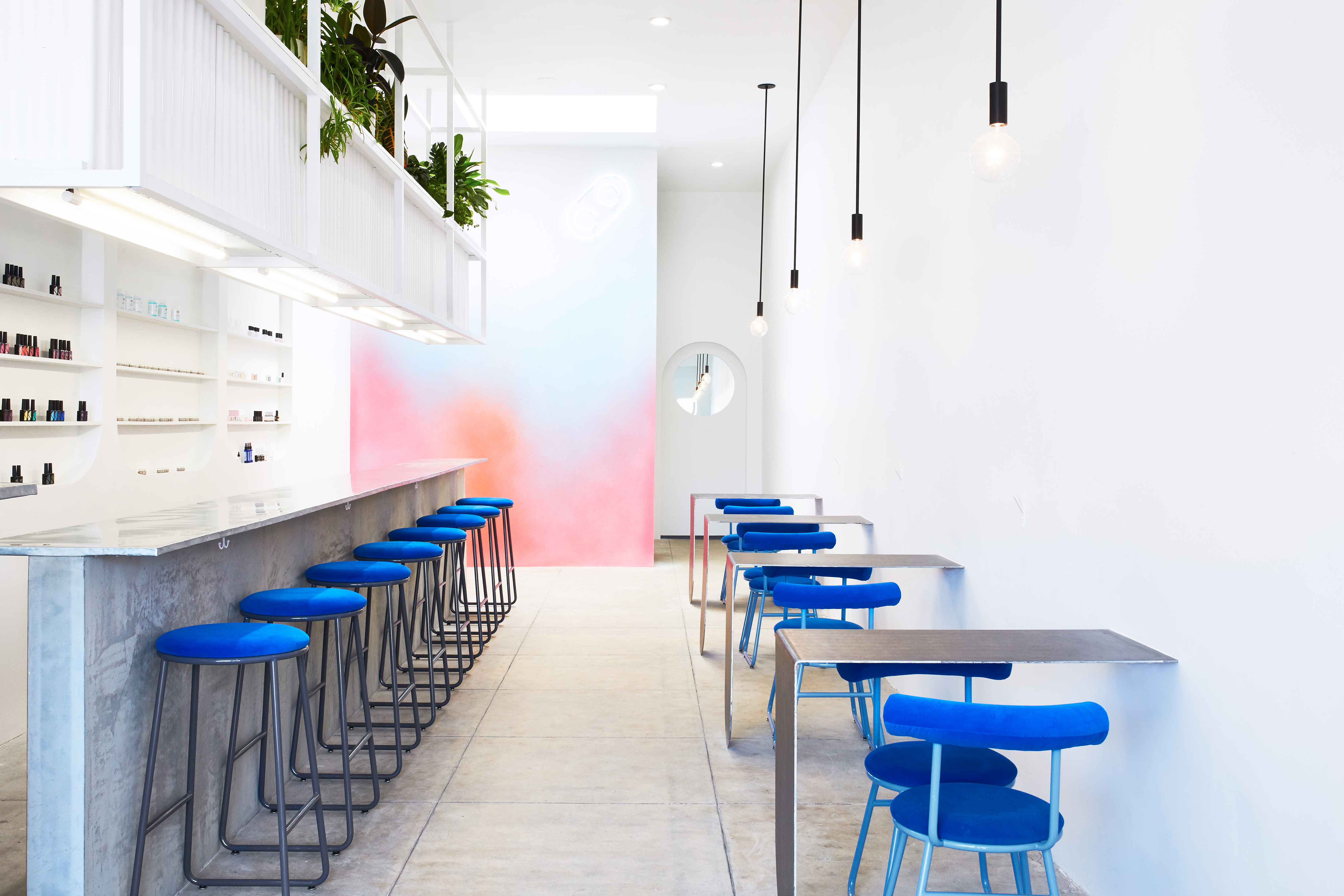
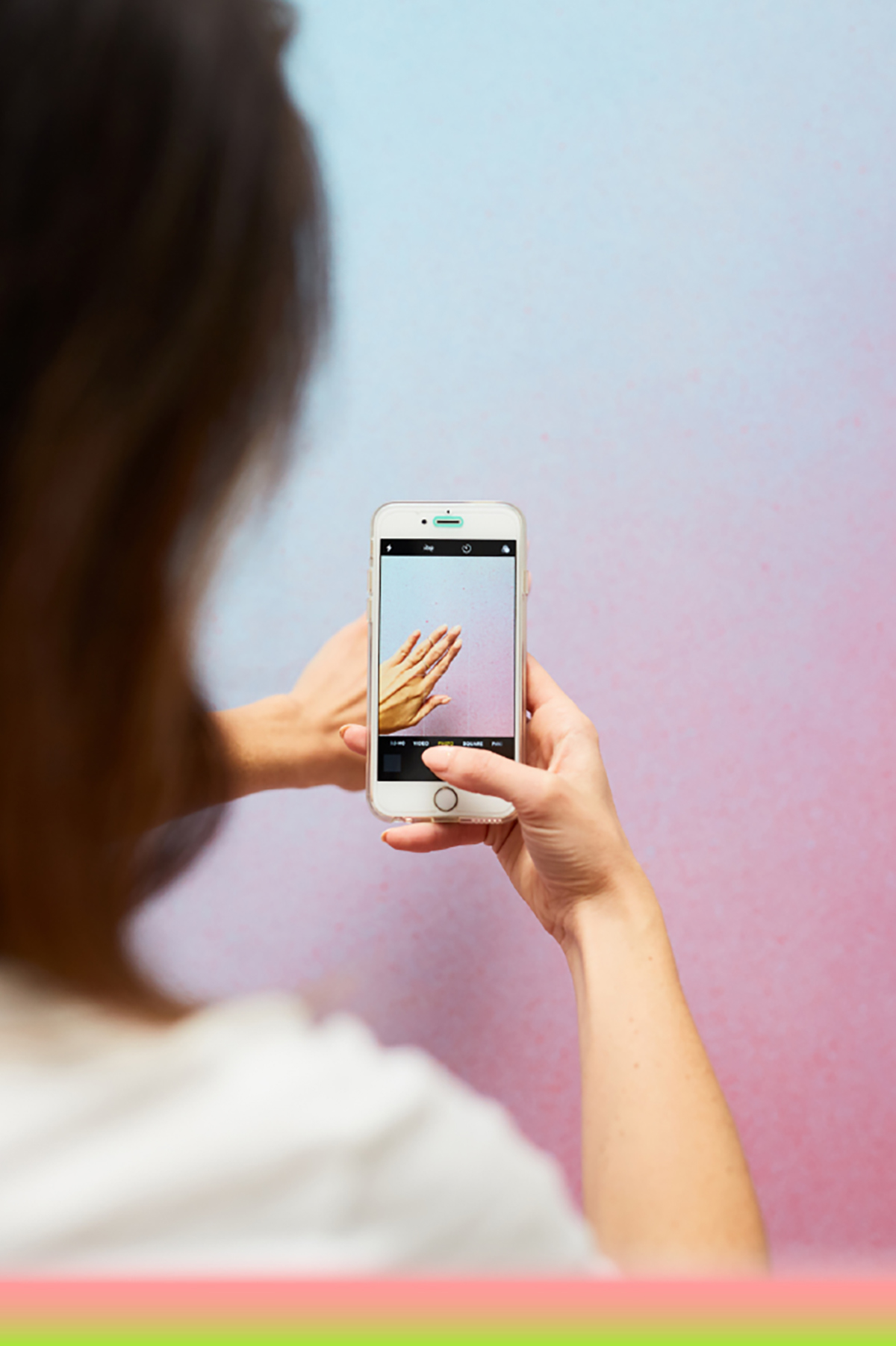
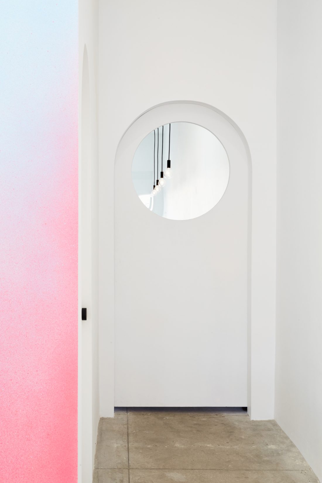
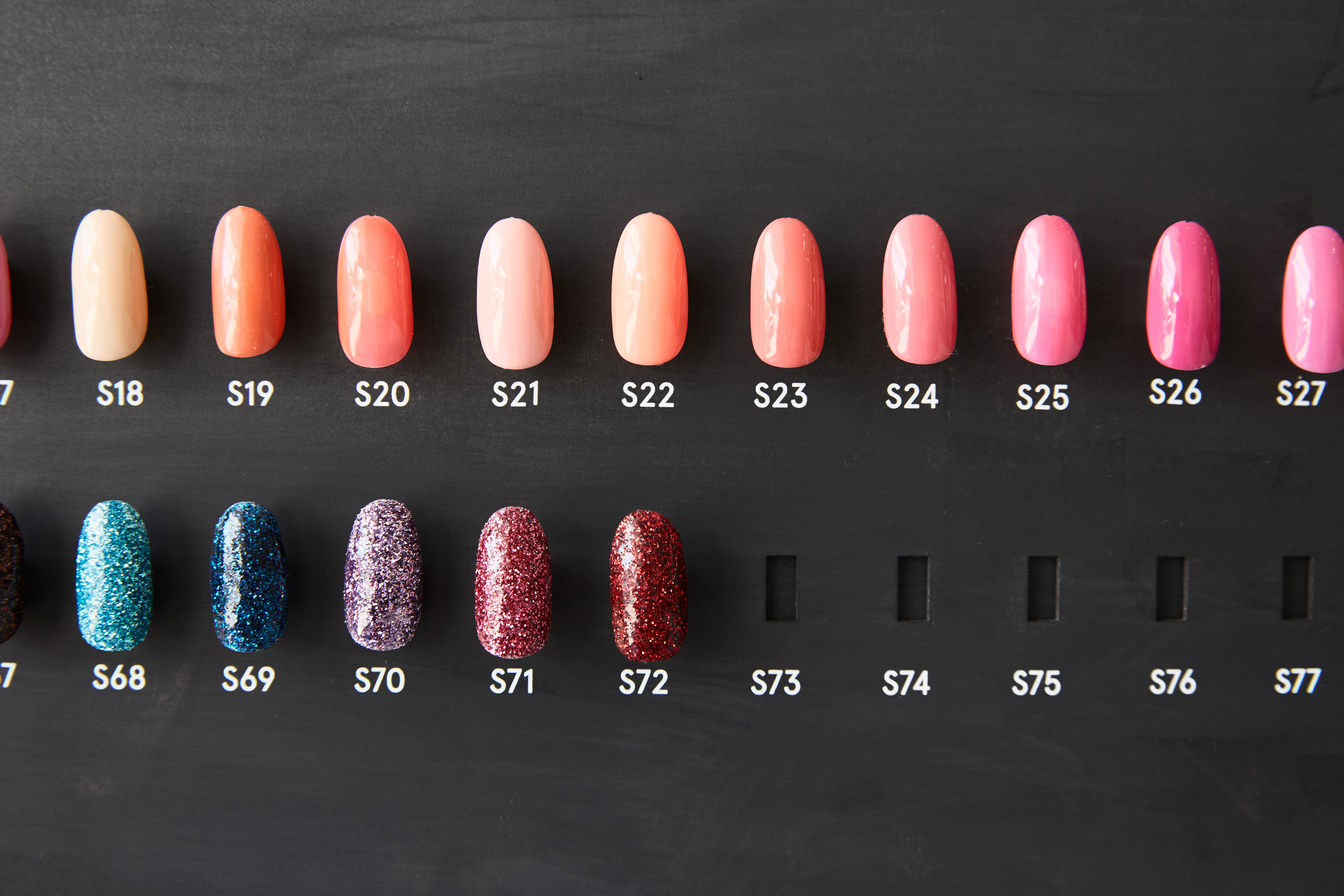
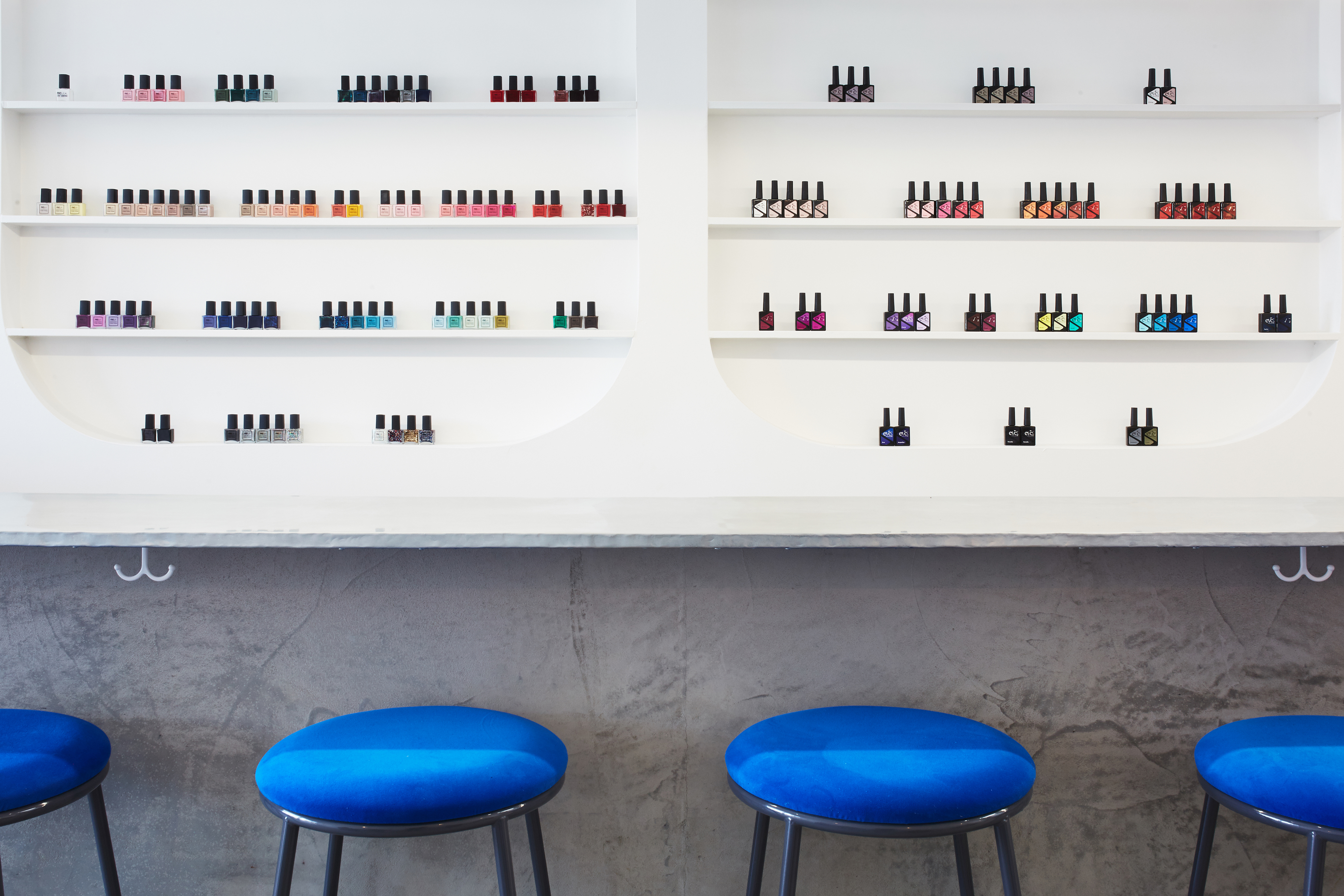
For the space, we really wanted to focus on creating a sense of playful discovery and avoid the predictable, cluttered environment often associated with contemporary nail salons. We created a bright white space enlivened with bold shapes – circles, semi-circles, concave and convex shapes play across bolsters, tables, shelving, doorways and branding. A gradient mural wall and custom bright blue furnishings bring pop accents of color and provide a backdrop of varying shades for your instagram manicure moment. We worked with the extremely talented architect J. Byron-H to create the interior design concept and make sure all our beautiful ideas would actually work in the 675 square-foot space. Nearly all of the fixtures and furnishings in the space were custom-made to our exact specifications. This allowed us to create a truly unique space and express a sense of visual cohesiveness not possible when buying off the shelf. Industrial materials like concrete and steel are cushioned by a vibrant gradient of pinks, oranges and blues, a contrast found throughout LA whenever the roughness of the city’s structures finds relief against its brilliant skies. Finally, the Color Camp menu was a feat in-and-of-itself: we developed a completely modular menu system that was easy to understand and aesthetically pleasing. Unlike a typical nail salon that has pricing on the wall, color on the rings of plastic wands, and nail art options on a sheet in a drawer, this custom menu showcases the different lacquers, color choices, and nail art options all in one place. The menu board also works seamlessly with the custom designed ordering form each client completes . The menu board consists of 3D printed magnetic molds that are interchangeable and can transition with the seasons alternating nail design and color trends.